Difference between revisions of "Coronavirus"

(Created page with "__NOTITLE__ == Coronavirus in the UK== Using the data that the UK goverment is making [https://www.arcgis.com/apps/opsdashboard/index.html#/f94c3c90da5b4e9f9a0b19484dd4bb14 a...") |
|||
| Line 76: | Line 76: | ||
|} | |} | ||
for which now the really relevant parameters is \chi. It seems alarming that the rate of contagion in Birmingham is larger than in London. Wolverhampton, on the other hand, remains growing at a rate a 6.25% lower than the national average. Note that the number of confirmed cases at day 24 (April 2), which is clearly above the fitting line, corresponds to 12 days after Mother's Day in the UK. At this point the number of deaths double every 3 days and triples every 5: unless we see something changing drastically during the weekend, UK will reach 10000 deaths on Wednesday next week. | for which now the really relevant parameters is \chi. It seems alarming that the rate of contagion in Birmingham is larger than in London. Wolverhampton, on the other hand, remains growing at a rate a 6.25% lower than the national average. Note that the number of confirmed cases at day 24 (April 2), which is clearly above the fitting line, corresponds to 12 days after Mother's Day in the UK. At this point the number of deaths double every 3 days and triples every 5: unless we see something changing drastically during the weekend, the UK will reach 10000 deaths on Wednesday next week. | ||
It is also interesting to see the ratio between the number of deaths to the total number of confirmed cases. The figure is shown below | It is also interesting to see the ratio between the number of deaths to the total number of confirmed cases. The figure is shown below | ||
<wz tip="Ratio of deaths to confirmed cases.">[[File:Covid-UK-deaths.png|480px|center|Ratio of deaths to confirmed cases.|link=]]</wz> | <wz tip="Ratio of deaths to confirmed cases.">[[File:Covid-UK-deaths.png|480px|center|Ratio of deaths to confirmed cases.|link=]]</wz> | ||
which indicates that the rate of death after 25 days is of 10%. Such a high rate might be inflated by the fact that UK is only testing patients at hospital when the test is ''the difference between a diagnosis that can save them'', which means that the confirmed cases are only those that got sick enough to require medical attention (which supposedly only a fraction of all the people). | which indicates that the rate of death after 25 days is of 10%. Such a high rate might be inflated by the fact that UK is only testing patients at hospital when the test is ''the difference between a diagnosis that can save them'', which means that the confirmed cases are only those that got sick enough to require medical attention (which supposedly only a fraction of all the people). | ||
Latest revision as of 04:30, 4 April 2020
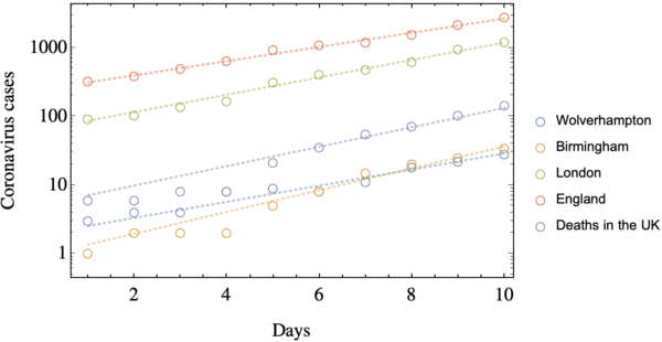
Using the data that the UK goverment is making available, updating it on a daily basis, one can fit the number of cases (of both infected people in different regions and of deaths across the island) n(t) as a simple equation \begin{equation*} n(t) = n_0 \,\chi^t\,, \end{equation*}
Early stage
At the early stage of the outbreak, while the government was still trying to tackle the pandemia with the so-called herd immunity, which in practical terms it means that no action was taken, and the contagions was left free to propagate. This measure was in the opposite direction that Europe was taking, where the mobility restrictions were starting to appear. At this early stage, the evolution of the cases was as shown in the figure below, which is shown in logarithmic scale:
<wz tip="Early stage of the pandemia in the UK">

</wz>
The open circles represent the data and the dashed lines correspond to the Eq. (1) with the following parameters:
| n_0 | \chi | |
| Wolverhampton | 2.55 | 1.31 |
| Birmingham | 1.36 | 1.44 |
| London | 86.96 | 1.34 |
| England | 315.25 | 1.27 |
| Deaths in the UK | 7.14 | 1.39 |
which means that at this stage the rate of contagion in the three cities above was larger than the average of the entire county. The case of London can be understood in terms of a multicultural city that serves as the connection from and to Europe, seeing thousands of passengers per day; and also to the high density of population. Birmingham is the second largest urban center of England, and Wolverhampton is very close to it, also with a high-density of population.
Social distancing
On March 24^\mathrm{th} (which is Day 15 since the start of the data) the Prime Minister Boris Johnson announced that people should remain in their houses, and only get out in four exceptional cases: i) buying essential groceries, ii) getting medical attention, iii) going to work (provided that you are an essential worker) and iv) to do one form of exercise. However, due to the incubation period of the virus, which is though to be around 10 to 15 days, the social distancing measures had to be implemented for an extended period of time.
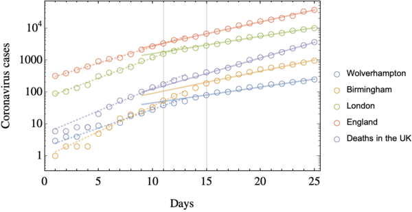
3^\mathrm{rd} of April: As of today the updated figure for the cases is the following:
<wz tip="Two weeks of social distancing.">

</wz>
where we see that the slope of all the curves are reduce more or less on day 11 (20^\mathrm{th} of March). It is suspicious that the change happens all across the cities at the same time: maybe different ways to measure the confirmed cases (and also the causes of the deaths) were introduce, or maybe people started self-isolating (even before it was imposed by the government). Regardless of the motive for the change, the curves are following these parameters:
| n_0 | \chi | |
| Wolverhampton | 14.73 | 1.12 |
| Birmingham | 18.64 | 1.17 |
| London | 463.51 | 1.13 |
| England | 515.21 | 1.19 |
| Deaths in the UK | 13.25 | 1.25 |
for which now the really relevant parameters is \chi. It seems alarming that the rate of contagion in Birmingham is larger than in London. Wolverhampton, on the other hand, remains growing at a rate a 6.25% lower than the national average. Note that the number of confirmed cases at day 24 (April 2), which is clearly above the fitting line, corresponds to 12 days after Mother's Day in the UK. At this point the number of deaths double every 3 days and triples every 5: unless we see something changing drastically during the weekend, the UK will reach 10000 deaths on Wednesday next week.
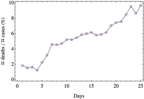
It is also interesting to see the ratio between the number of deaths to the total number of confirmed cases. The figure is shown below
<wz tip="Ratio of deaths to confirmed cases.">

</wz>
which indicates that the rate of death after 25 days is of 10%. Such a high rate might be inflated by the fact that UK is only testing patients at hospital when the test is the difference between a diagnosis that can save them, which means that the confirmed cases are only those that got sick enough to require medical attention (which supposedly only a fraction of all the people).